Adelphi Hotel Logo
Overview
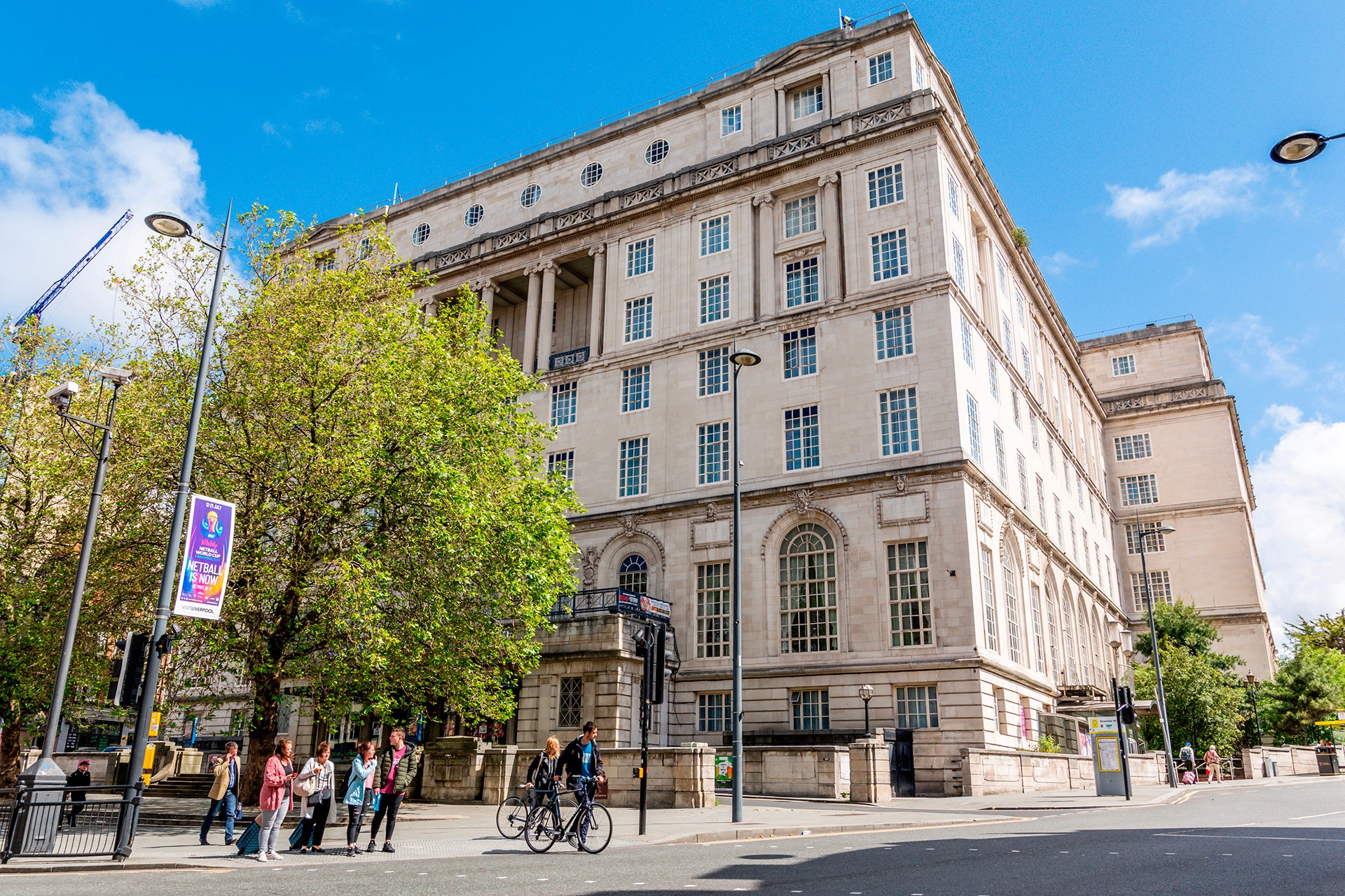
The Adelphi Hotel in Liverpool, owned by Britannia Hotels, is a landmark building dating back to the 1910s. As part of the Britannia Hotels marketing department, I was tasked with creating a new visual identity that captured the prestige of the Adelphi while setting it apart as one of Liverpool’s most iconic hotels.

Process
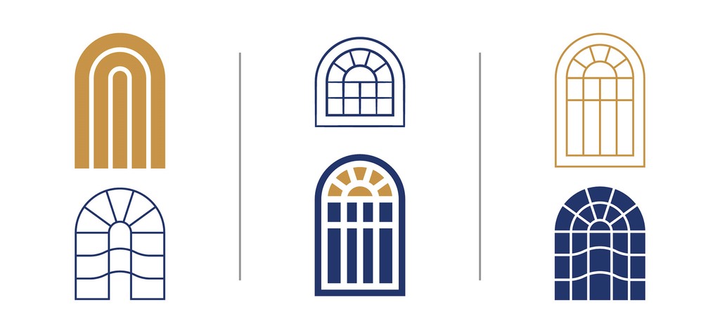
The project began with an exploration of the building’s architecture to identify features that could translate into a timeless logo. While the initial brief suggested using the silhouette of the building and surrounding trees, I looked deeper into the hotel’s design details. I sketched and tested a range of window and bay shapes — from abstract to literal — to see what would work best as a recognisable icon. After discussions with the Head of Marketing, we refined the direction and I developed three strong variations for presentation.

Challenges
Problematic Initial Brief: The suggested silhouette of the building felt too blocky and generic, while the inclusion of trees posed a risk to the logo’s longevity since they weren’t permanent to the property.
Finding an Iconic Feature: The challenge was to identify a distinctive element of the Adelphi’s architecture that could work as a recognisable and elegant mark.
Respecting the History: The logo needed to respect the building’s heritage while still feeling fresh and usable across modern branding applications.

Results
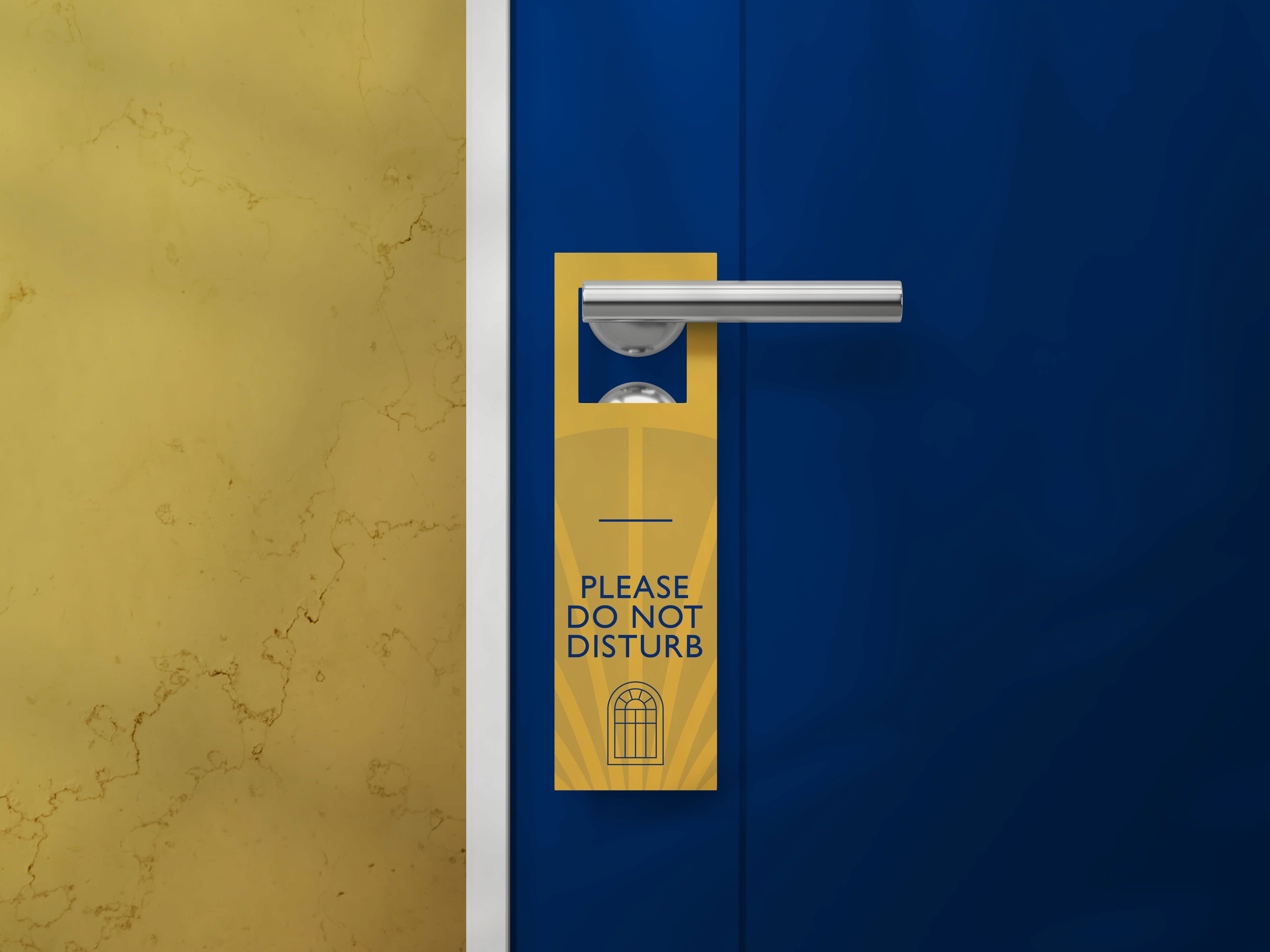
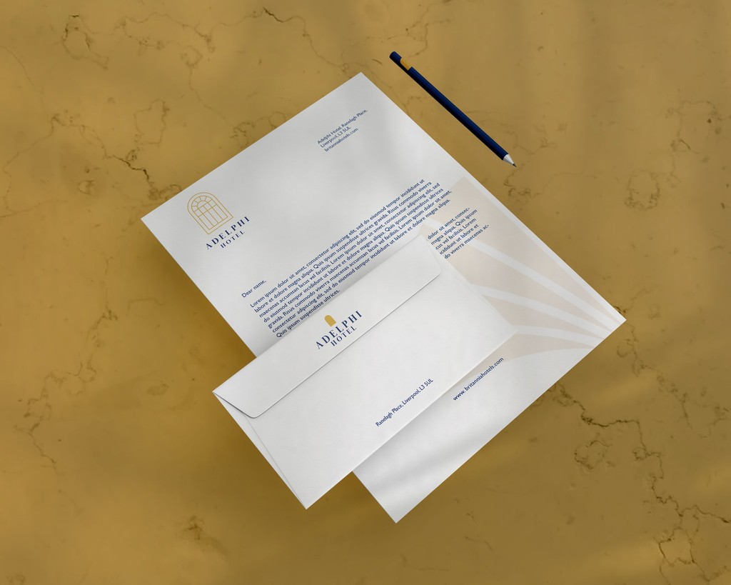
The final visual identity drew inspiration from the Adelphi’s distinctive windows and bays, distilling them into a refined, versatile mark. This approach gave the hotel a logo that felt rooted in its history but flexible enough for contemporary use. The new identity was well received by the marketing team, praised for being both instantly recognisable and true to the Adelphi’s iconic status in Liverpool.